Passion Project
UX Design
Improve the Loyalty Function of Caffè Nero App
Oct 29, 2024

01. The Starting Point
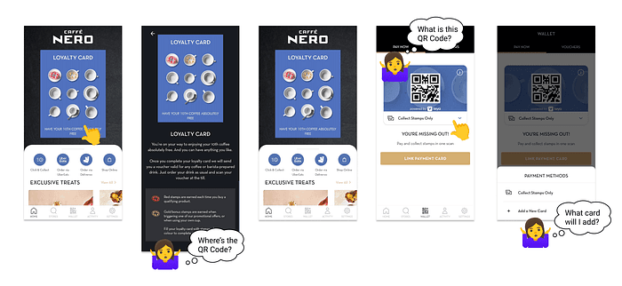
Recently, I downloaded the app to take advantage of Caffe Nero’s loyalty card promotion. Excited to start collecting stamps while buying my coffee, I opened the app and looked for the loyalty card QR code. However, after searching the homepage and loyalty card explanation page, I couldn’t find it anywhere!
Undeterred, I explored further. The “wallet” section seemed like a promising lead, but the options there only added to the confusion. What did “add a new card” mean? Did it refer to a new loyalty card or just another payment method? Feeling frustrated, I ended up asking the cashier for help.
This is where my project came in…
02. Defining the Problems
Here’s a breakdown of the confusing elements:
Miss of Loyalty Card Access: Our instinct, as mirrored in many apps, is to tap the image or link to load the correspondence function. However, clicking the loyalty card image didn’t lead users to the loyalty card’s QR code.
Unclear Functions and Wording: Terms like “wallet” can be ambiguous. Surely, I can find payment methods here, but does the function include loyalty cards as well? Similarly, the purpose of the QR code and the type of card you can “add” are unclear from the app itself.
03. Validating the Problems
My first hypothesis was that users who wanted to load the loyalty card would click on the loyalty card image. To understand if these problems are valid, I conducted a first-click test with the following settings,
Problem: Users struggle to find the loyalty card’s QR code in Caffe Nero’s app
Goal: Users can point out where to find the QR code in the app
Methodology: unmoderated testing
Tasks: Provide the app's homepage with the question “Where will you click on if you want to load your loyalty card?”
The result of the first-click test
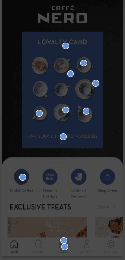
73% (8 out of 11) of participants clicked on the image of the loyalty card itself.
The result validated my hypothesis and suggested that tapping the card image would be the most direct way to access the loyalty programme.
Interestingly, 2 participants chose the “wallet” session, indicating that while the card image might be the first attempt, users would also go for other options.
This highlighted the importance of a clear and user-friendly “wallet” experience.
04. Preparing for Redesign
I would focus on solving the problem of missing loyalty card access. Since Caffe Nero uses a third-party portal called “Teya” to manage loyalty features, I would find solutions to improve user experience without changing the app's layout completely.
05. Refining the Layout
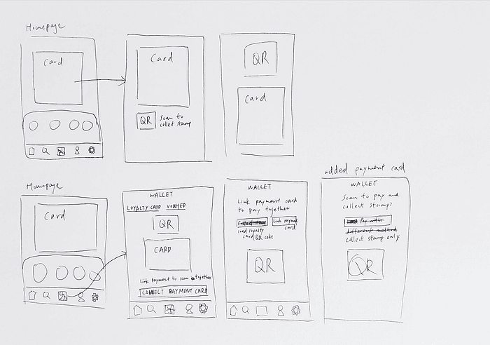
I created two designs for integrating the QR code into the Caffe Nero loyalty card page with the following criteria,
Ensured the QR code and loyalty card image are immediately visible without needing to scroll
Positioned the QR Code in a clear and accessible location
Communicated the purpose of the QR code clearly, avoiding any confusion for users
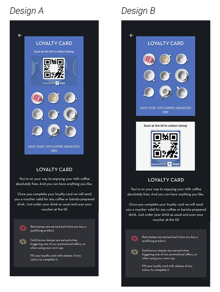
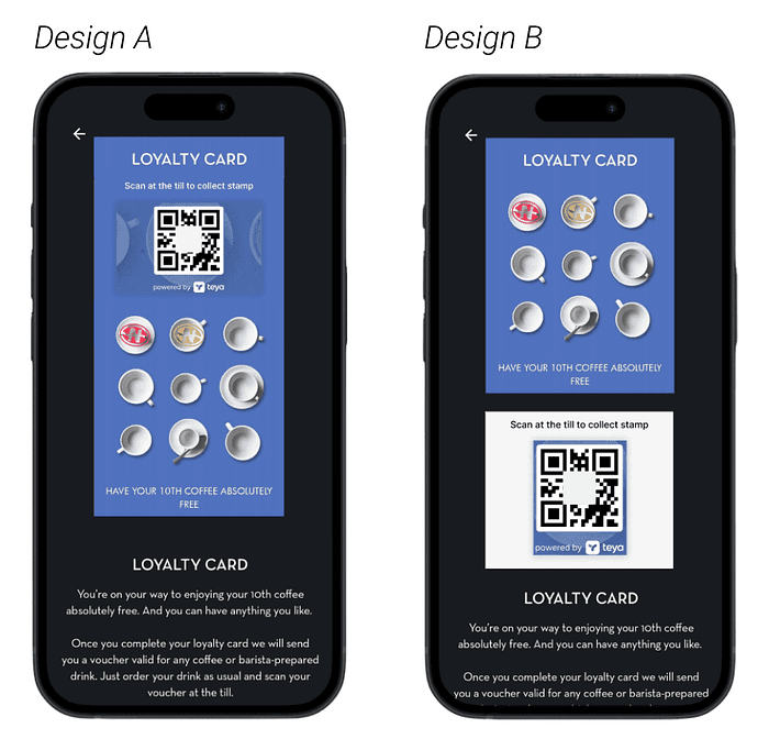
Design A: Top Placement:
Pros: This design positions the QR code at the top of the page, so users can easily scan the code without needing to aim, and the QR Code is associated with the loyalty card, meaning that users can identify the function of the QR Code immediately
Cons: The QR code size is smaller, which might affect scannability
Design B: Larger QR Code:
Pros: This design prioritises scannability with a larger QR code, which is especially beneficial for users with older phones
Cons: The QR code is placed in a lower position, which might make it harder to aim and scan
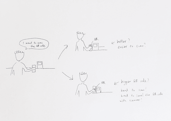
My sketches of how the users would interact with the scanning machine at the till.
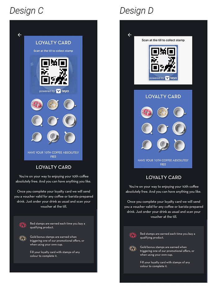
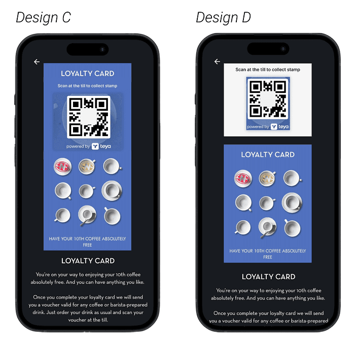
I then combined the advantages of Design A and B and created Design C and D.
06. Follow up
This personal project was a part of a full user research. My next step will be as follows,
Feasibility Check: I will collaborate with the development team to determine if both Design C and Design D can be technically implemented within the existing loyalty card layout and the 3rd party portal’s limitations.
User Testing: If both designs are feasible, I will conduct a second user test to identify which version offers the most intuitive and efficient scanning experience.
Tackle Unclear Functions and Wording Problems: The Wallet Page caused me lots of confusion. After completing the first user problem, I will follow up on this user problem.