Passion Project
Web Design
Refine the Product Page of an e-commerce to Display Out of Stock Product(s)
Jul 18, 2025

01. How everything started
As a houseplant-holic, I am always hunting for new plant shops. Recently, I found a website with a lovely plant labelled “new arrival.” I immediately clicked into the product page out of excitement.
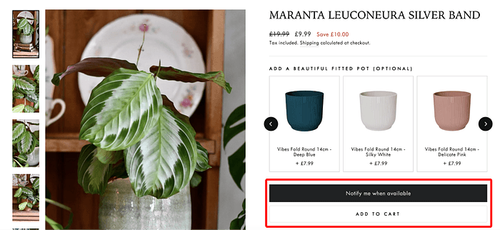
But the product page left me scratching my head. There were 2 buttons, with one saying “notify me when available” and the other “add to cart.” I couldn’t figure out whether I could add the plant to the cart, or if the plant was out of stock.
To test it, I clicked “add to cart” and the website seemed to confirm the plant was added to the cart. But when I tried to continue, a pop-up showed up with the message: “Your cart is currently empty.” I tried the same process again, but no luck — the empty cart message kept popping up. It was frustrating!
Besides, if you have noticed, for some reason, the buttons switched place when I recorded the screen.

02. Here come more problems!
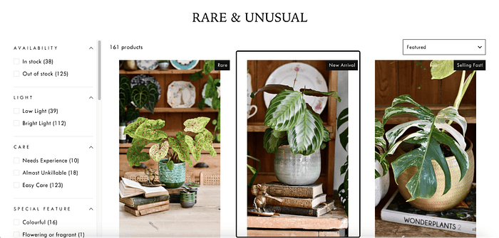
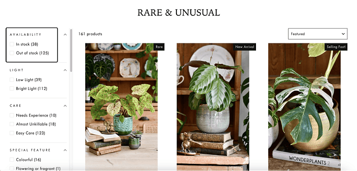
I then returned to the product page and noticed a filter for item availability. I clicked on “in stock” and “out of stock” filters. Finally, I found a product that was marked “Sold Out” on the page, but not for all. Surprisingly, some out-of-stock plants have a “selling fast!” tag.
At this moment, my brain was filled with doubts.
I found the filter.
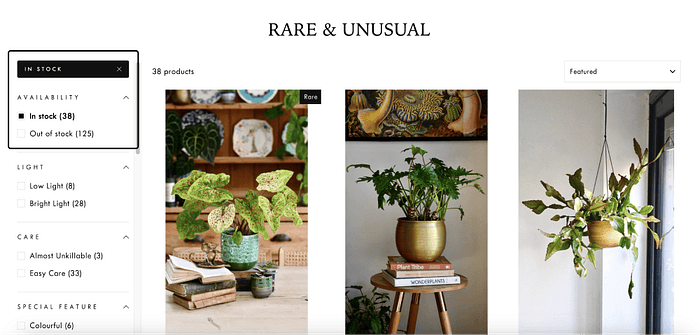
Clicking on in stock items, everything looks right.
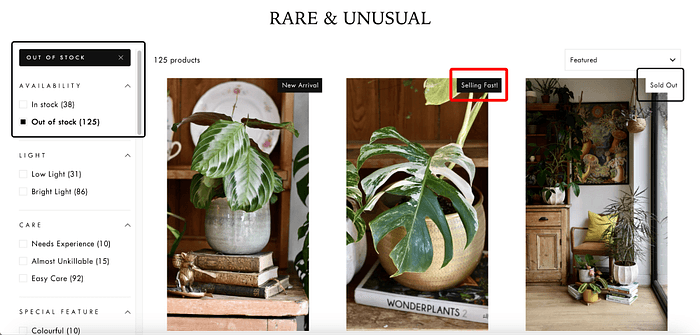
Out of Stock items as follows… I surely believe the product is selling a bit too fast…
03. Validating the Problems
I summarised three main issues while trying to purchase a product from this website:
Unclear Tagging: The “new arrival” or “selling fast” tags on the main product page didn’t indicate the item was unavailable. It gave the impression that the product was in stock
Confusing Buttons: The presence of both “notify when available” and “add to cart” buttons on the product page created significant confusion. It wasn’t clear whether the item could be purchased or not
Misleading Checkout Process: After adding the product to my cart, I received a confirmation message. However, upon clicking “continue,” a pop-up appeared stating “Your cart is empty.” This left me confused and uncertain about why the item hadn’t been added successfully
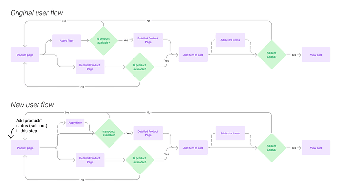
Firstly, to have a picture of how users find out if a product is in stock, I mapped out the user flow of the website. There were two main paths:
Apply a filter > check availability: This method worked smoothly, allowing users to see which items were available before handing to the detailed product page to add the product, but it required extra clicks that are not noticeable in the flow, meaning that users might overlook the function
Land detailed product page > find related button: This path caused lots of confusion because users could “add” out-of-stock items to their cart, but the item disappeared from the cart after that
I wanted to streamline the process for a better user experience. Therefore, I need to fix both issues. However, in this project, I will first focus on improving the user flow in the main product page.
My goal is to allow users to understand if a product is in stock or out of stock as early as they can.
To achieve this, I changed the user flow by adding product status to the main product page. This also eliminates the need to apply filters to determine product availability.
*Remark: I realised afterwards I didn’t conduct any user tests to validate if other users had the same problems. However, I was uncertain if I needed a user test for a scenario that was obviously not optimised like this one. Would love any feedback from experienced Designers!
04. Start Designing
I sketched a few possible changes to be made on the main product pages to show the availability of the products without needing to click anything.
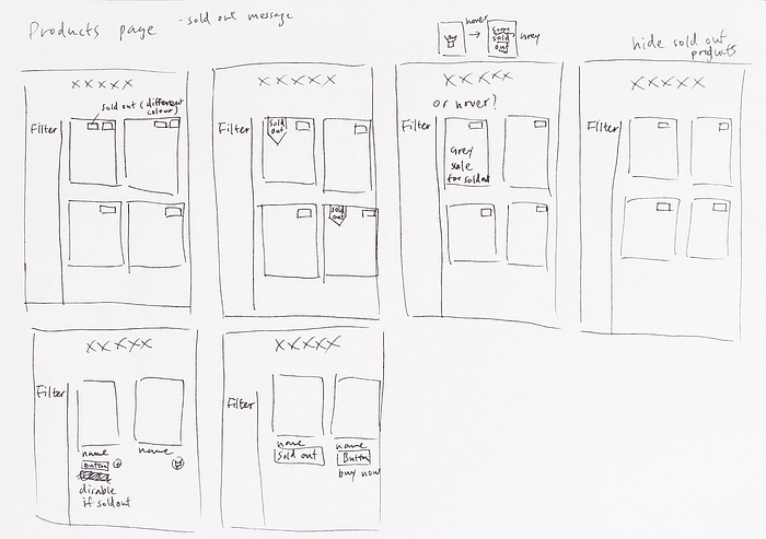
I summarised my drafts in 3 directions, including,
Adding extra tags/content on product images to show availability
Applying hover to display additional information
Concealing sold-out products automatically
I then analyse the pros and cons of each direction.
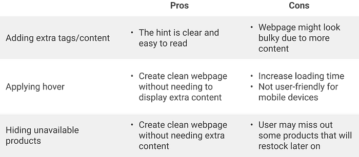
I decided not to proceed with the option of hiding unavailable products, given that businesses tend to showcase their full inventory, and displaying out-of-stock items allows customers to learn about products and potentially pre-order them.
I adapted the hover effect into an overlay for a better mobile user experience and created three versions.
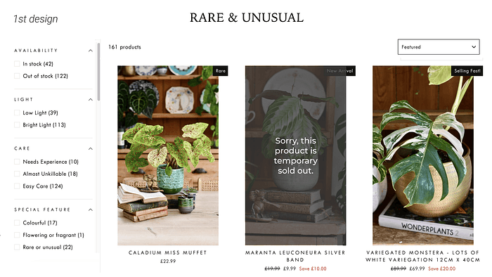
1st Design
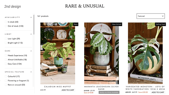
2nd Design
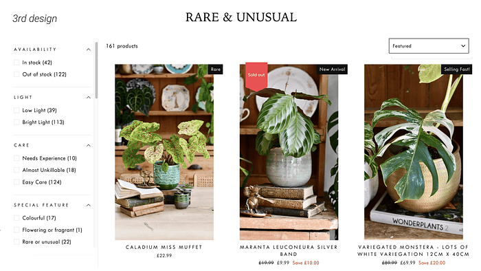
3rd Design
05. User Testing time
With the designs ready, I conducted a preference test, showing participants the three designs and asking the following question: “Which design makes it easiest for you to understand if a product is in stock?”
15 participants took part in the preference test, and 73% chose the 1st design because it stood out more clearly compared to the other options.
There is a visual indication that is big enough for me to see that the item is sold out. The other indicators were small or just text based which may work if the visual indicator was more than just a corner of the image.
Immediately visually obvious; pictures are the first thing I look at in this layout.
Since its big on the picture and not a small red “sold out” label, it’s easy to notice it without spending a lot of effort
There’s also an interesting comment from the participant, thinking that it will be cool to be able to see when the product will be restocked again.
It is obvious because the picture is darker and writing fills more space. (However if I am really interested, I like to have the option to know if it’s back in stock — or maybe there is this option below the picture that is not captured)
27% chose the 3rd design because it aligned better with the overall visual style of the website.
I really like a red Sold Out warning on product image, because it’s really visually clear.
This and the grey overlay one both work, however this one fots(fits) better with the visual design
A participant also mentioned restock.
I think it is the clearest, because the third one looks like isn t coming the product any soon but this one give the feeling they may restock soon…
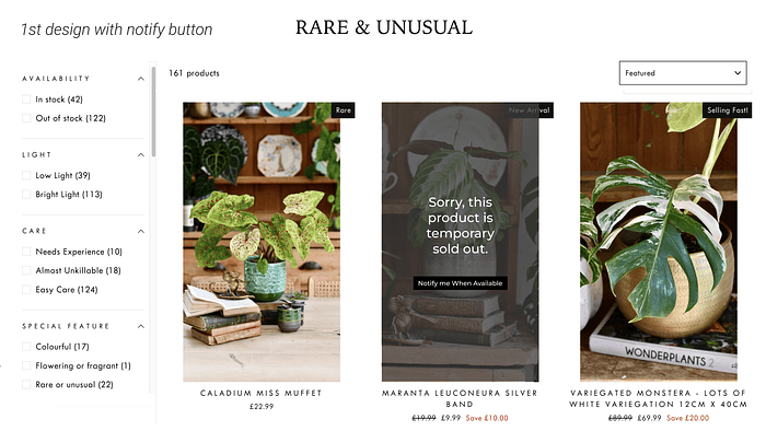
With the feedback from them, I added the “Notify me when available” button to the winner.
06. Follow Up
With the new designs on hand, here are my next steps,
A/B test on new designs: I would proceed an A/B test on the website to see which design has a higher conversion rate on users leaving their details
Fix the button issue in the detailed product page: The detailed product page displayed both “Add to Cart” and “Notify me when available” buttons on the same time. This seems to be an technical error, so I will collaborate with development team to fix this problem
Also, as mentioned before, after completing the preference test, I realised I might need a usability test to validate whether the new user flow was truly an improvement before starting to design anything.
I hadn’t considered this initially because, based on my intuition, simplifying the flow seemed like an obvious win for user experience. I assumed testing wasn’t necessary at that stage.
However, this experience raises a crucial question: when should I conduct usability testing? Resources are limited, so we can’t test every hypothesis. As a junior UX designer, I’m eager to learn when testing is truly essential and how to prioritise it effectively.