Passion Project
Product Design
Revamp the Packaging of Waitrose’s Canned Fish
Apr 8, 2024

01. The Starting Point
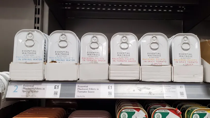
I regularly keep canned fish stocked in my pantry. On a recent visit to Waitrose, I stumbled upon their own-brand canned fish and decided to give it a try.
As I looked into the session, I noticed that all the cans looked similar, which led me to spend nearly 1 minute reading each label. I finally chose “Mackerel Fillets in Spicy Tomato Sauce”.
02. Defining the Problems
I never spent so much time selecting canned fish, and found it interesting for me to dive into the underlying issues. I pinpoint the problems at hand,
The cans have similar designs, which makes it hard for me to pick out the specific one rapidly on the shelf
The label lacks a hierarchy for me to identify the products’ category (mackerel or sardine?)
The spacing of the label is tight
The light yellow colour of the words “mackerel fillet” is hard to read
03. Validating the Problems
I created a digital version of the product with Figma and did the following,
I conducted a colour accessibility test, the “Mackerel Fillets” in yellow failed, and the “in spicy tomato sauce” in red passed.
The line spacing is 100%. Most of the time, the optimal line spacing is between 120% and 145% of the point size.
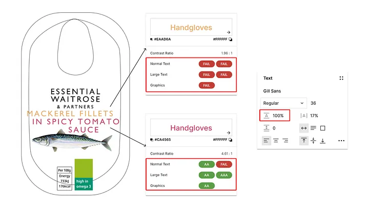
The result validated my assumptions about the readability issue.
04. Preparing for Redesign
I will separate the process into 2 parts. The first part will be redesigning the product that helps users identify the product, the second part will be finding out if the design could provide users a better experience.
05. Understanding the Brand’s Design Style
I will need to make sure my designs align with the brand’s design style.
Since the design system of Waitrose is private (WDX (Waitrose Design Experience)), I summarised the brand’s design style (with a little help from AI) from this website: https://medium.com/waitrose-partners-digital
Clean, simple and modern aesthetic
White space, clear fonts, and a limited colour palette
High-quality product photography and lifestyle imagery
Aspirational and inviting brand experience
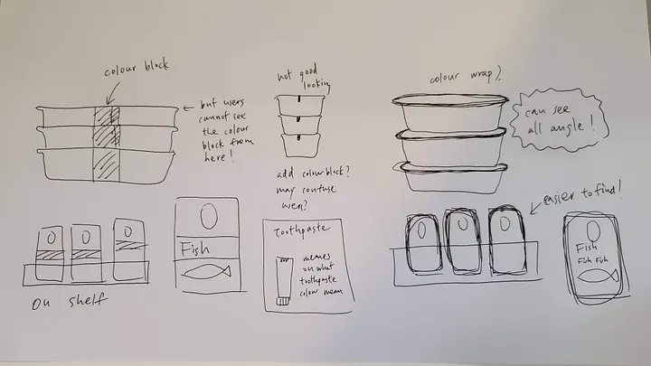
06. Redesigning the Product
There are 2 main objectives: increasing the readability of the label and helping users identify the product while they are on the shelf or stocked without needing to read the whole label.
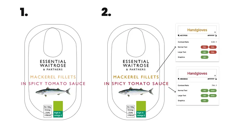
I separated the elements
I tried to stick to the same colour tone from the current design, but realised it was impossible to find a yellow tone that could advance the colour accessibility test.
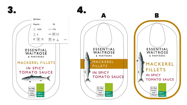
Since I did not wish to opt for a different colour tone, I picked a mustard colour, which has a better contrast as a compromise.I assigned a 120% spacing to all lines
I created 2 new designs, let’s call them new design A and new design B
07. Testing the Designs
I need to test if the new designs are more accessible compared to the original one. I conducted a preference test by asking users, “Which design do you think is easiest to read and identify the product?”
13 participants joined the test. Here’s the result,
54% of participants picked new design A because it displayed the product name clearly and drew the most attention from users.
I didn’t notice the “In spicy tomato sauce” until I saw this design so I would say it clearly communicates the product, brand, and nutrition information.
Its the one that caught my eye the most. The horizontal orange stripe made it pop out more.
Title inside strip with good contrast
Highlight the product name
38% of participants agreed that new design B has a clean appearance with few distracting graphics and good contrast.
8% of participants picked the original design because it is “simple and easy to read”.
Conclusion: the New design A has the best readability.
08. Next Step
This personal project was a part of a full user research.
My next step will be conducting more user research in a real-world environment to understand how users interact with the product. Meanwhile, I will speak to the stakeholders to decide if we will move forward with the new design.
I will address the following challenges,
There is not enough data to support that changing the design will benefit users, which means we will conduct more research to validate if the hypotheses are valid.
Changing the design of one product may impact the consistency of the brand’s current design and identity, meaning that we will provide solid data on the benefits of changing design and communicate with different stakeholders about the impact and the solutions before moving forward.